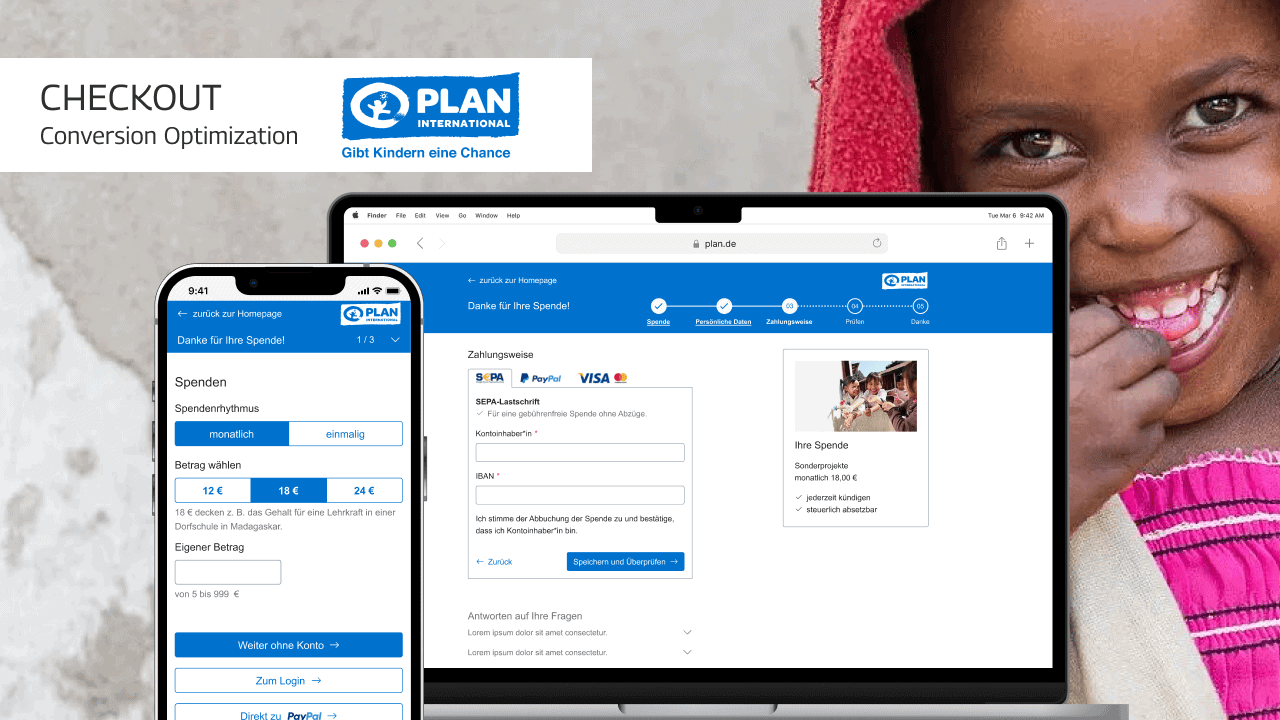
Less friction — more checkout conversions
Summary
In this pro-bono project, I supported Plan International, an NGO that collects donations and offers child sponsorships to help children in need.
I was tasked with finding improvement opportunities for the checkout flow for donations and sponsorships, with a focus on conversion optimization.
Based on a heuristic evaluation and a competitive benchmark, I redesigned the checkout flow to offer a frictionless user experience for better conversion on both mobile & desktop.
A simpler and more intuitive checkout form
On desktop, one of the biggest problems was a somewhat cluttered layout that did not use the available space in the best possible way. The resulting cognitive load was a likely culprit for checkout abandonment.
In the new design I established a clear visual hierarchy by removing unnecessary page elements and using a one-column form layout with fewer fields for faster and easier completion.
I then replaced the celebrity testimonial with a donation summary to provide encouragement and reduce cognitive load.
The navigation between process steps is now more intuitive: it indicates clearly where the user currently is and where they can go.
A lean process for fast results
In order to deal with the project constraints, I opted for a short and lean process that allowed me to achieve the maximum results with the limited resources:
- Heuristic Evaluation: I audited the existing checkout flow based on best practices.
- Report & Strategy Session: I discussed the results with my client and proposed different scenarios for improving the checkout.
- Competitive Benchmark: I performed a competitive analysis of comparable checkout flows of similar NGOs. This helped me answer questions like:
- Should we use a multi-step or single-step checkout?
- How to best deal with gifting options in the context of donations?
- Interviews: I needed to find out how to best build trust in a donation checkout. So I conducted 5 to 10-minute interviews with recent donors. I asked them about doubts they had and what information they needed.
- Redesign: Based on the collected insights, I redesigned the flow. I used the standard components of the client’s frontend framework to keep development effort low.
Providing reassurance in the checkout
The client requested a special focus on trust-building during checkout. My hypothesis was that there is a difference between trust-building and reassurance.
Trust-building vs. reassurance
People decide for or against an NGO before the checkout process and trust needs to be formed there.
During checkout, people rather need reassurance that they are doing the right thing.
With insights from the user interviews I created a donor journey model:
Landing pages need to capture the donor’s attention, help them in their consideration phase and move them along until they make the decision to donate. Here, we need to build trust, e.g. with celebrity testimonials or transparency measures.
Once the donor is in the checkout, the decision has already been made. We want them to they conclude their donation, get appreciated and ideally form loyalty. Here we need to provide the following reassurance:
- about the choice of donation (type and amount)
- about canceling recurring donations and tax deductions
- easy access to FAQs during checkout
Redesign for reassurance
The redesign focuses on providing reassurance to people by
- engaging them emotionally,
- addressing doubts, and
- answering questions that haven’t come up until the checkout.
I therefore removed the celebrity testimonial and replaced it with a donation summary that answers the most important questions:
- What am I donating for?
- What about payments and taxes?
The summary shows the amount and purpose of the donation—in case of a child sponsorship with the photo of the child to evoke emotions—as well as the information that payments can be stopped at any time and that the donation is tax-deductible.
I added an FAQ section at the bottom of the screen to provide more space for information that had previously been placed in-between the form fields (e.g. what kinds of businesses are and are not allowed to donate).
This way, Plan International had the flexibility to adapt and add to the FAQs without requiring layout changes. At the same time the form feels less cluttered.
Less friction, more conversions through improved login and account creation
Login and Guest Checkout
The existing flow offered a guest checkout, PayPal checkout and Login across multiple steps.
The new design positions all choices next to each other in step one and provides a clearer visual hierarchy on the login page.
Account creation
“Interrupting all guest users to suggest they create an account too early — before or in the middle of the checkout process — was observed to cause some participants to hesitate and stop their progression through checkout.”
Baymard Institute
In the existing flow, user can open an account in step 2 of the process. Benefits are explained poorly.
The redesign offer account creation in the last step, only after the user has completed the checkout. The page clearly lists the benefits of having an account.
Here’s what they have to say.
Do you want to increase your conversions?
I’m happy to discuss a strategy for your website in a no-pressure 30-minute strategy call where you can
- talk about your website goals,
- get free strategy advice,
- get a pricing quote.
You can find information on how your data is processed in my privacy policy.